
A useful interface does not need to compete for attention. It should help someone understand where they are, what matters now and what they can do next.
Start with the moment, not the screen
Imagine opening a planning app before a busy day. The first question is rarely how many features it has. It is simpler: where should I begin? That moment is a better starting point for design than a list of screens.
Clarity is not the absence of information. It is knowing what deserves attention.
Make the next step visible
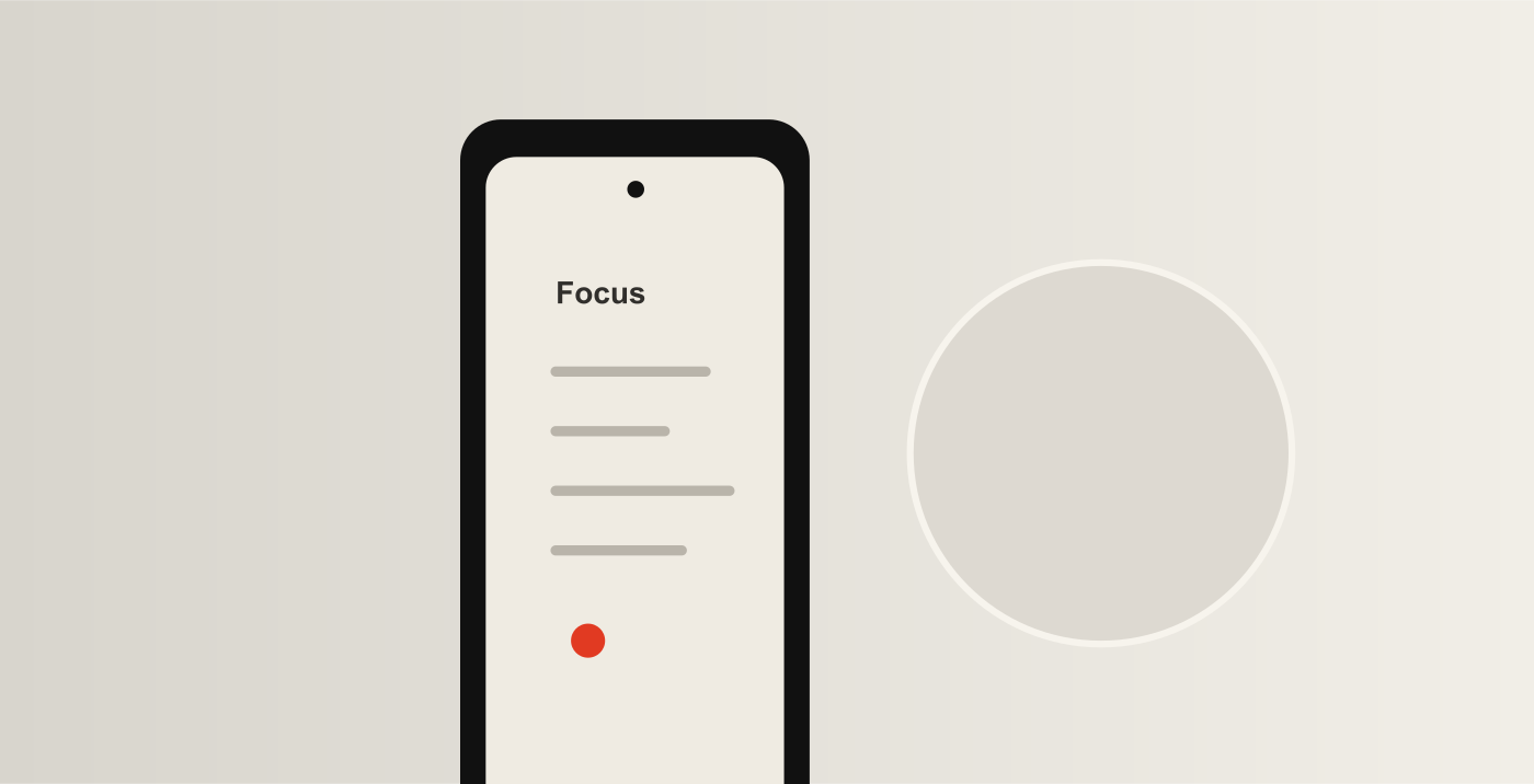
In the Calmly concept, a quiet layout and one clear primary action create a starting point. Colour highlights a current priority instead of decorating every element. This is a design exploration, not a tested claim about productivity.
Three questions to take into a review
- Can someone identify the next action without reading every label?
- Does each piece of information help with the task at hand?
- Can people change their mind without losing their work?
Leave room to learn
A tidy mockup is only a hypothesis. The next step is to observe people trying a realistic task, listen to what confused them and revise the design. Simplicity is useful when it makes the experience clearer for the person using it.